Wednesday, October 31, 2007
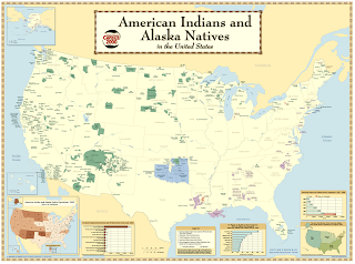
Symbology Map (Example Map)
Choropleth Maps (Example Map)

Choropleth maps and statistical data are natural partners. When trying to communicate important staistical data, the message can often be lost in a pile of seemingly unrelated numbers. But when that data is shown visibly on a map, the message that a researcher is trying to communicate comes accross crystal clear. This map shows the mortality rate per 100,000 people in 1997.
Tuesday, October 30, 2007
Monday, October 22, 2007
Monday, October 15, 2007
Subscribe to:
Comments (Atom)


