It took me awhile to look through everybody’s projects and decide whose maps looked the best. There were many nice ones but some were just striking to me; whether it was color or style or just plan appearance once it was all put together.
Part A Top Five Labs
1.) Eric’s Digital Cartography Blog by Eric Gerhart
http://egerhart.blogspot.com/http://egerhart.blogspot.com/2007/10/proportional-symbols.htmlI like Eric’s map on “Total Housing Units in the State of Maryland” Proportional Symbols because this map was very clear to read and the house symbols just jumped right out at you when you looked at the map.
2.) Nathan’s Blog by Nathan Lann
http://natesblog310.blogspot.com/https://blogger.googleusercontent.com/img/b/R29vZ2xl/AVvXsEim_oa0AgnZErg89AbAbM1Ss_hXrm8K353Ky8AxU1S7M796nMrha6E94_6VtZIPmvbnplQXAdM3XO_RdU_9oVSmvKSWAN1CPMtRL2eDv5IJhw99_AoVSB1sdFY8PyI6vb7XKnD-yxcstGY/s1600-h/lab10.jpgI like Nathan’s Lab 10 “Total Population Vs Median Household Income in North Carolina---Bivariate Map of North Carolina. I especially liked the color combinations you chose because it draws your eyes into the really populated area which were more in the center of the map. The symbols were placed in a nice spot where you can clearly read everything.
3.) Introduction to Digital Cartography by Chris Mackey
http://cmackeydigitalcartography.blogspot.com/ https://blogger.googleusercontent.com/img/b/R29vZ2xl/AVvXsEjUqKC_Yc7dQgBlxJEr-r3eztlyclbIVfp6CLeokyshQ1lal_OMy4F2JX3lwbqFKbSyYKyw1veWvbv2jYp95iIjziiRUynq56NCxF5CwrPlxJFjM3-MMWaH0_XGHvThGryHGxE2Qkbrd1s/s1600-h/310project10.jpgI like Chris Mackey Bivariate Map. The color combination is excellent. The grays and the blues really off set everything very well. The gray looks like it was made transparent a little bit so that you could still see the counties.
4.) The Geog and Mappin’ Place by Matthew McConnell
http://mattwthrman.blogspot.com/https://blogger.googleusercontent.com/img/b/R29vZ2xl/AVvXsEjJX52SXd0YGQfgWSIEAHB0-dh45DLmEMMr52YPMB-j3ZQYJDC_C_SUyPFdvlVpf9KsLp70NnZKvKalqnInws29lPyBMy-cdOynUupsIDjJza4ZWd-IGwqUGCQHk2fHtWhUJxAUFIp4HBYR/s1600-h/MatthewNCmap.jpgI really liked your Bivariate map you created. I could not click your map to the other page but I still could view it even at a smaller view. I like your color combinations. You can never go wrong with light colors. They are always warm and soothing. I like the way you created your symbols (one inside the other). This is an interesting way of doing it. It may not work for all maps but it sure does work for this one.
5.) Gerry’s Geography by Gerald
http://gerrysgeography.blogspot.com/https://blogger.googleusercontent.com/img/b/R29vZ2xl/AVvXsEjmAbQ520YnXo9m42RBGZE6JbixZBey2bjWxca5LKGcDrCP_EDyQFvsJNrNSoNrF6jv4WhrruSJ69yHs-hSxqurSfsqmSWs1mTP6PN8w7297I8ZVAgKSp0fEQurmx0HBDqyHvE1nmAC3vdx/s1600-h/nc2.jpgFirst, I am glad I stopped to check out your website. I never heard of GIS Café but I really liked it after viewing it. Anyways, I like your Bivariate Map. For most maps the gray background would be to dark but for this particular map---it looks great. I like your straight faces you used. I think that was really creative and with the color combination on the map; it really made everything stand out and look great together.
Part B Top Five Examples
1.) Gerry’s Geography by Gerald
http://gerrysgeography.blogspot.com/https://blogger.googleusercontent.com/img/b/R29vZ2xl/AVvXsEiHDGy-IjpPE1x6AiXARE-MUR7VHw9C4go-G2wKloudFI5QK8z7LHplUySOOMc_5SoEnPdh2mo-GgyKQTKSOdh3JsiklvDFSU1kYxuunMuz7pFWARTGFl8YVAugGc85jyg6H-ceZxKci0Xg/s1600-h/166710882_5f0a34380a.jpgDisneyland colored map you posted was really awesome. This map has come a long way since the old one. Of course, Minnie mouse helps top off the map.
2.) Parker Cartography by Leanna Parker
http://parkercartography.blogspot.com/https://blogger.googleusercontent.com/img/b/R29vZ2xl/AVvXsEiDMA2bPZEBH7wYiDvia8csOCIbt8NVHmmEse7IB_hIpdjqWxRJFt16djaC9JZkcsyIITlCX_fDrQ2-a3_XK01oJUuMeaaAZ9wGEg_NfFb9jhXfaN4m04TYFBteplI3zKceFUIahJaBbzo/s1600-h/UW2Castle.jpgI like “The Castle of Lord British”. This is such an interesting map especially for being such an old map. They were truly artistic and creative back then.
3.) The Geog and Mappin’ Place by Matthew McConnell
http://mattwthrman.blogspot.com/https://blogger.googleusercontent.com/img/b/R29vZ2xl/AVvXsEhhVCPhtm3N_NWvFBq7I6ut9wl4C45pkz_5SNfpfXfBWi5uIpKk1t9Ub0BT2WlXav1P1YSigiLTgnlYTyRfnv5AypQVGxn7CnjqWozuoqkvYqLNpibJ13k9h4q4Aj8pW2G1V033-KEEfbe3/s1600-h/pctasian.jpgI like the Bivariate Map that shows the Asian population in Fairfax etc. The colors they used were quite interesting. They help you to locate the specific counties.
4.) Nathan’s Blog by Nathan Lann
http://natesblog310.blogspot.com/https://blogger.googleusercontent.com/img/b/R29vZ2xl/AVvXsEiKar0wioOI-dLFguR6PyQUAWTjpL4d7hqvLTXALkDTU8ICIsAcdkJ4sMDXMOiqeJ7RcbgaJn8ghC9HrYiUlcipftn5oszXQcqYTVGc8ZGdebo5yTO-Nohz1w6O3yzPYghQd4rWUEL4ZBU/s1600-h/elderly_aian_big.jpgI like the Dot Density Map of American Indian and Alaska Native Elders from the 1990 Census Bureau. I f I am not mistaken, this map was presented at one of the GIS days events I went to. I totally love this map for many reasons. I like the pale blue-pink background. I like the way they clustered the dots and made them bleed together. I also like the pink they used for the United States. It really brought out what they were trying to get across.
5.) Eric’s Digital Cartography Blog by Eric Gerhart
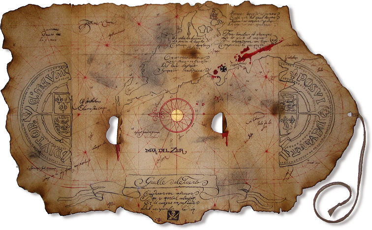
http://egerhart.blogspot.com/http://www.indyprops.com/pp-goonmap1.jpgI like the “Cool Tyography”. For an ancient map, this one is really cool. I am amazed that people back than could create such beautiful maps that not only gave information but was artistic looking too.


